Creating a Main Menu
So for this assessment we have been tasked with developing a main menu for a game in a fantasy, sci-fi or sports genre. I am a big Sci-Fi fan so I am going to be picking a game in this category. I have played allot of Sci-Fi titles covering a wide range of game genres but by far my most favourite and most time spent would be the MMORPG game EVE Online. EVE Online is a game which has appealed to me mainly because of the freedom it allowed within its huge game world. Huge spacial environment with beautiful ambient music adding a gorgeous feel of adventure and urge to explore the seemingly infinite world.
Lets have a look at some of the key points to look out for when creating a menu for a game. These points are based on a very good article which points out some important things to think about when designing a menu.
You can find the article at: http://kotaku.com/5955855/the-ten-commandments-of-video-game-menus
So first of all lets not jump straight to the main menu lets talk a bit about the splash screens that lead up to the main menu. Even though this is nothing to do with the main menu it still effects a players mood once they are at the main menu. So one of the more annoying things players face when turning on a game is non skippable splash screens advertising the companies involved with making the game. Now as interested as the player may be the first time they switch on the game you can more or less guarantee by the umpteenth time they switch on the game they will very annoyed at being made to watch each of the numerous splash screens fade in and out before reaching the menu. So quite simply it is in a designers interest to make these skippable.
Another great point found when doing research was games that have anything other than continue as the first selectable option in the menu. This is for a simple reason we dont want players to either accidentally overwrite an existing game or start a new game and be forced to watch the very long non skippable cut scene So what we want is if we have a player who is too eager to wait and bashes the "A" button constantly they will be put straight into the game where they left off and not forced to reset their console and start over again.
We also dont want to put any lengthy cut scene videos before the a player gets to the menu. Save it for when they begin a new game. Either a player will skip this and miss an important aesthetic you were trying to make the players feel or just prolong the load time until the menu appears.
I dont like menus that confuse a player to what is actually highlighted by the selector for example those games that always ask for a yes/no selection and one word is highlighted white and the other an off white and all the text in the game is off white so you think that the white highlighted word is the selection only to find that it was the off white word that was being selceted. So a nice simple bounding box or other visual selector to show a player what they currently have selected.
Automatically saved option settings are a must so that a player doesn't "back" out of the options menu only to find all their preferences are now back to default and didn't save.
Now as EVE Online is an MMORPG it always greets you with a menu to log in with which cannot be avoided with any game that requires log in via a user account. So I will create a menu based on an offline version of EVE Online or maybe just a menu that would greet you after you log in and not just throwing the player straight into the game.
This is the current look of the EVE Online login screen:

Picture referenced from own copy of the game
As you can see it is quite basic with large plain white text for the title and a small area at the bottom dedicated to logging in. There is also some information telling players how many people are currently logged into the game. One thing you cannot see in this image is that the 3D objects in the menu background are actually animated and are not still. The meteor at the top is slowly spinning and the structure to the right is rotating. There is a soft sounding ambient music track playing at the same time which all in all creates a nice peaceful aesthetic.
When you click on the single button you get a futuristic computer confirmation sound before the game goes through the process of logging you in.
I want to take a look at some other Sci Fi game menus and analyse them to see features I like and how well they work.
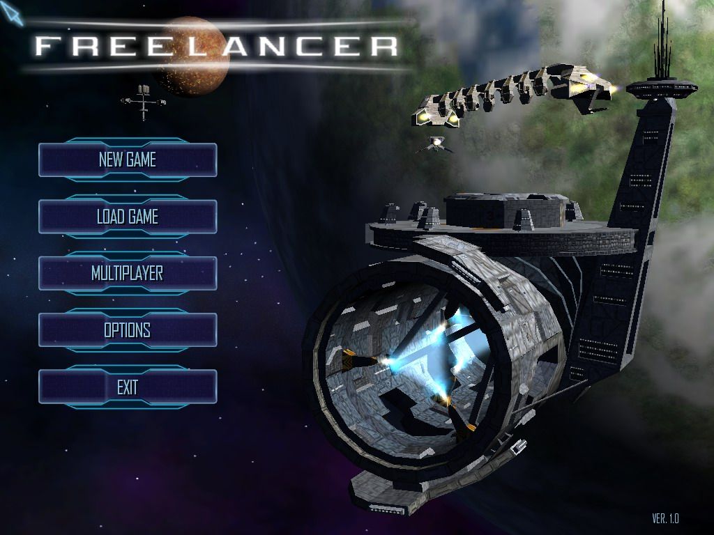
Freelancer

Picture reference: http://www.mobygames.com/images/shots/l/160771-freelancer-windows-screenshot-main-game-menu-is-shown-on-the.jpg
So above we see the main menu for the game freelancer. We can see again that the game uses an animated 3D landscape as the backdrop for the menu. I really like this as the main point that appeals to my love of the genre is the space setting. How massively huge, eerie and unknown it is. You can also see a small planet in the distance with a larger planet resembling earth in the foreground and a curious looking structure in the very near foreground. I like how they have a space craft flying near the structure which gives you an impression of how big everything is.
So lets have a look at the menu layout. I really like the futuristic computer style button designs on this menu that react to mouse overs and clicks. The text is very clear and the layout is very simple. The text is all in capitals which helps it stand out. Also the buttons are very big which makes it easier not to accidently click on the wrong item. This wouldn't really matter in a console version of the game as a player simply moves a selector up and down the menu items.
I think however it would of been better to swap the load game and new game menu options around so that a player doesn't accidentally start a new game when hurrying into their game. At worst a first timer playing the game may do is try to load a save game that doesn't exist and that would only happen once. All in all I like this menu as it is simple and effective and I love the gentle 3D animation in the BG of the menu which looks nice as a screensaver should a player leave it sitting on the main menu.
X3 Albion Prelude
.png)
Picture from own copy of the game
So above we have a menu splash screen for the game X3 Albion Prelude. Once again we see a common theme in space Sci-Fi menus. We see the animated 3D background setting the games aesthetics right at the menu. The buttons here seem a bit more simple than those of freelancer. Also you can see a small problem here with the menu button mouse over highlight is the same colour as the button text which obscures what the button says. One feature I do like in this is it gives you a button to watch the opening cutscene again wherever you like which is good if you want to refresh your memory on game story events. The new game button needs to be swapped with the continue game button again for good flow and continuity. Same sort of ambient theme backing music setting the scene for the game before you even get started.
Dark star One

Picture from own copy of the game
This is Dark star one. It is another seemingly open world space game. Here is the start menu as you can see once again the game has an animated 3D background with a space station in the foreground. I like how the planet gently rotates and its moon orbits around while the space station floats quietly in front of them. Here the designers have put the title of the game in the middle of the buttons but in the lower left of the screen not hiding away the amazing background landscape. The buttons are very clear and each highlight on mouse over.
Again the designers seem to have put the New game button at the most prominent position where as there should be a continue button. If you think about it the new game function is used way less than the Load Game button. In fact only once will you need to use the New game button. Even though the buttons are of a similar colour to the background they are still easy to see.
Menu Concepts
Concept 1
+_.png)
So this is a very rough first menu concept. For the background I used a beautiful space scene from http://101goldpuppies.edublogs.org/files/2011/07/Misconstrue-Space-Art-681299-1oagfnk.jpeg
I then used the well known look of the word EVE from the game except I flipped the last E backwards for symmetry and used a radial gradient to create the "O" for online. I then game the title a thick white stroke border to create a nice contrast between the title and the background. For the buttons I stuck with the same colour pallet as I did for the title except I added an opacity of 50% so that the BG could still be seen through the buttons. I then put one of the EVE ships flying of into the distance. I wanted it so that on each start of the game a different ship from EVE was visible.
Concept 2
.png)
In this concept I went for a minimalist approach. I raised the ship to a higher layer so that it sat in front of the games title and had just the one button. Once you enter this button you are in game and you can then do everything you could normally do in multi button menus.
Concept 3
.png)
In this concept I decided to try out a 3D effect on the menu which would be floating gently up and down. Here the player gets 3 basic options of start, options and exit.
Concept 4
.png)
Here I have simply added a colour change and the location of the title and so far I am way more happy with the colour pallet here. The blue subtly goes with the background.
I have also added in an eclipse and flare effect on the screen with the ship flying towards it.
Concept 5
.png)
In this one I gave the title a dodge effect and made the button text sparkle. This gives an epic feel to the game. Also note that I have arranged the ship layer so that it is behind the menu text.
Concept 6 and final concept
.png)
This one is very similar to the last except I have added a hazy border and removed the ship from view. I like this one the most as it fits with the games epic feel and sets a very nice aesthetic. The backing track for the menu I have picked is called The Divide by Jean-Pierre Taieb and needs to be listened to while viewing the menu for EVE Online. You can hear the track here http://www.youtube.com/watch?v=7ohY9dI2uks. I feel the music adds that final touch and really brings the menu together. Its hard to explain it on paper So I hope you have it playing in the BG while viewing my final concept to see if you can feel what I was trying to put across while creating the menu for this game.
Bibliography
Freelancer Menu
EVE Online/ Dark Star One and X3 Albion Prelude Menu pictures
From own copy of the game.
Spcae BG
No comments:
Post a Comment